Website Redesign
Chrysler was updating their branding and website and I was responsible for leading the effort. This included a top to bottom redesign of the information architecture, design and user experience.

- UX Lead
- Automotive, Agency, UX Design
- https://www.chrysler.com/
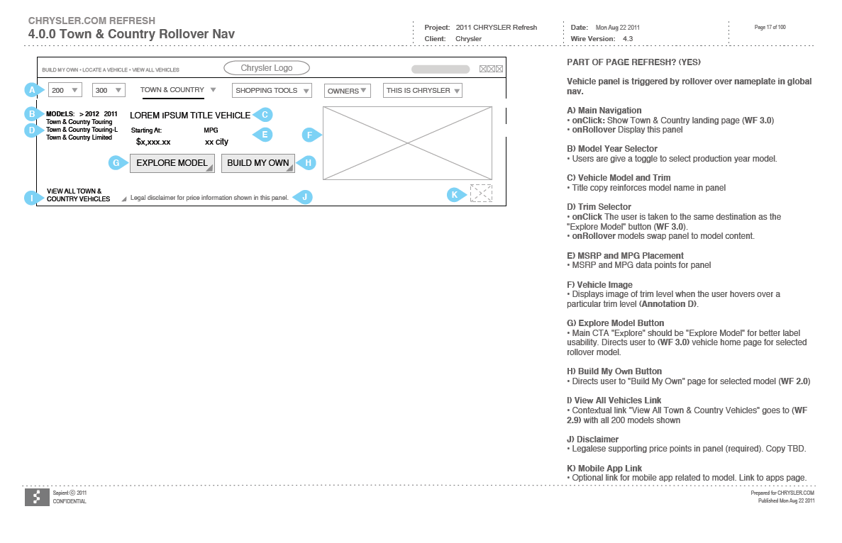
Hero Nav
The Chrysler brand leveraged a very robust hero navigation that allowed access to the entire website from a top level. In addition users could get at a glance information on a specific model without having to visit the model page for that specific model.
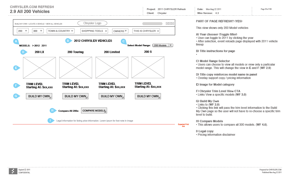
Model Landing Page
The model pages allowed the user to view a side by side comparison of each model trim level as well as get an overview of the model itself.
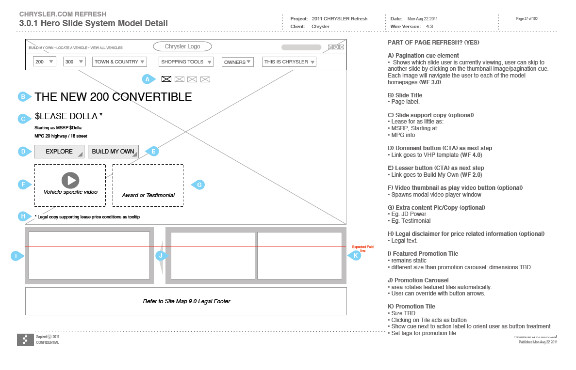
Slide Modal
Certain top level model pages included a sliding hero style panel that allowed Chrysler to display updates and discounts directly to the user inline with their current model selection.
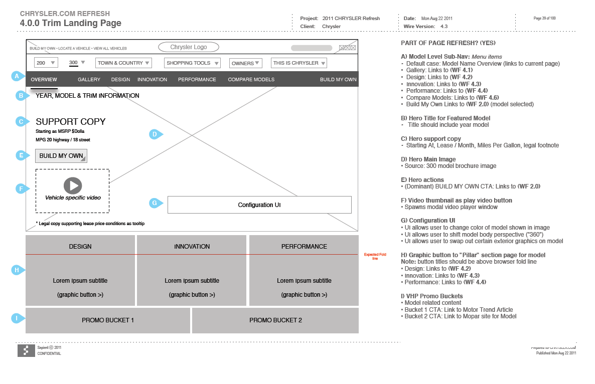
Trim Landing Page
Trim level pages were similar to model pages in layout but typically provided more specific information to that model trim level. These pages shared performance data, design and specifications as well as several links to videos and build pages.
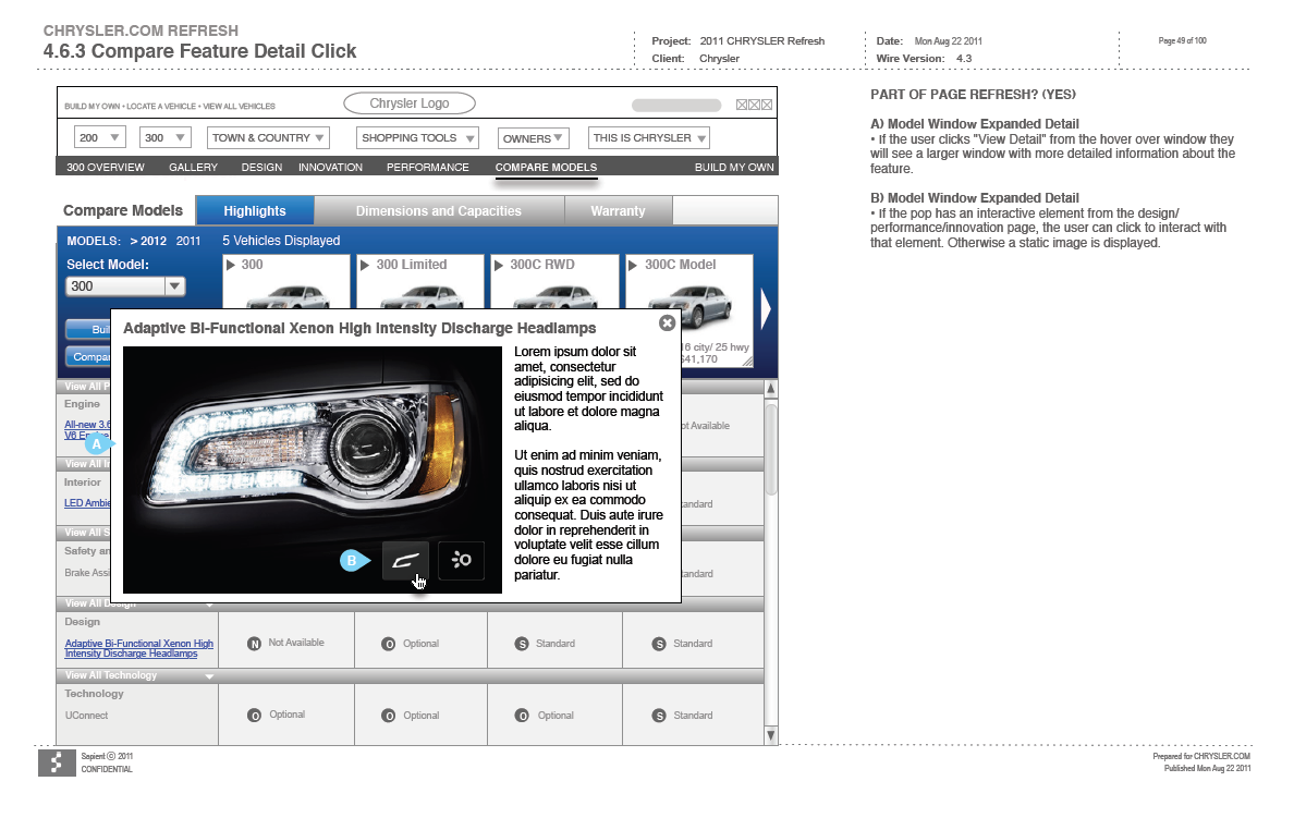
Comparison Page
The comparison page would display multiple models at the same time to help the user determine differences between them. These pages also incorporated many of the interactive elements found on model and trim pages that presented some of the different features on the vehicles. In this example the user is able to turn on and off the headlights for the 300 model cars.
