Delta Airlines
Deltas booking application is confusing to those who are not familiar with the application. Users often struggle to book their flight successfully the first time and complain that they weren't able to see all of the costs or misunderstood the initial price of their flight. Many users were unaware of what additional features meant and some didn't understand they could choose their seat at the time of booking. An overall revamp of the flow required elevating information to meet users were they are at the time they need to consume details for each step in the booking process.
- Senior User Experience Designer
- Travel, UX Design
- https://www.delta.com/
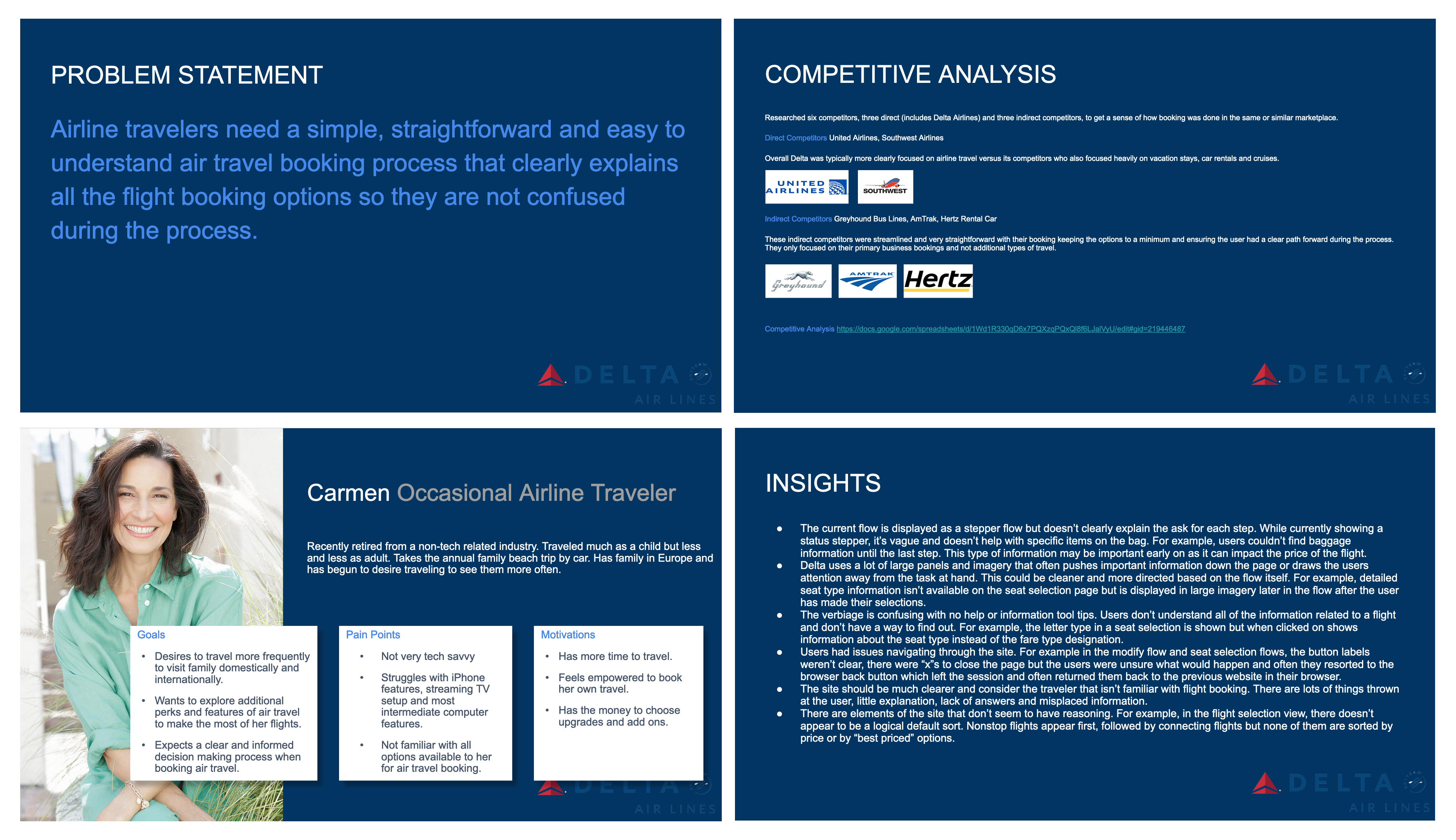
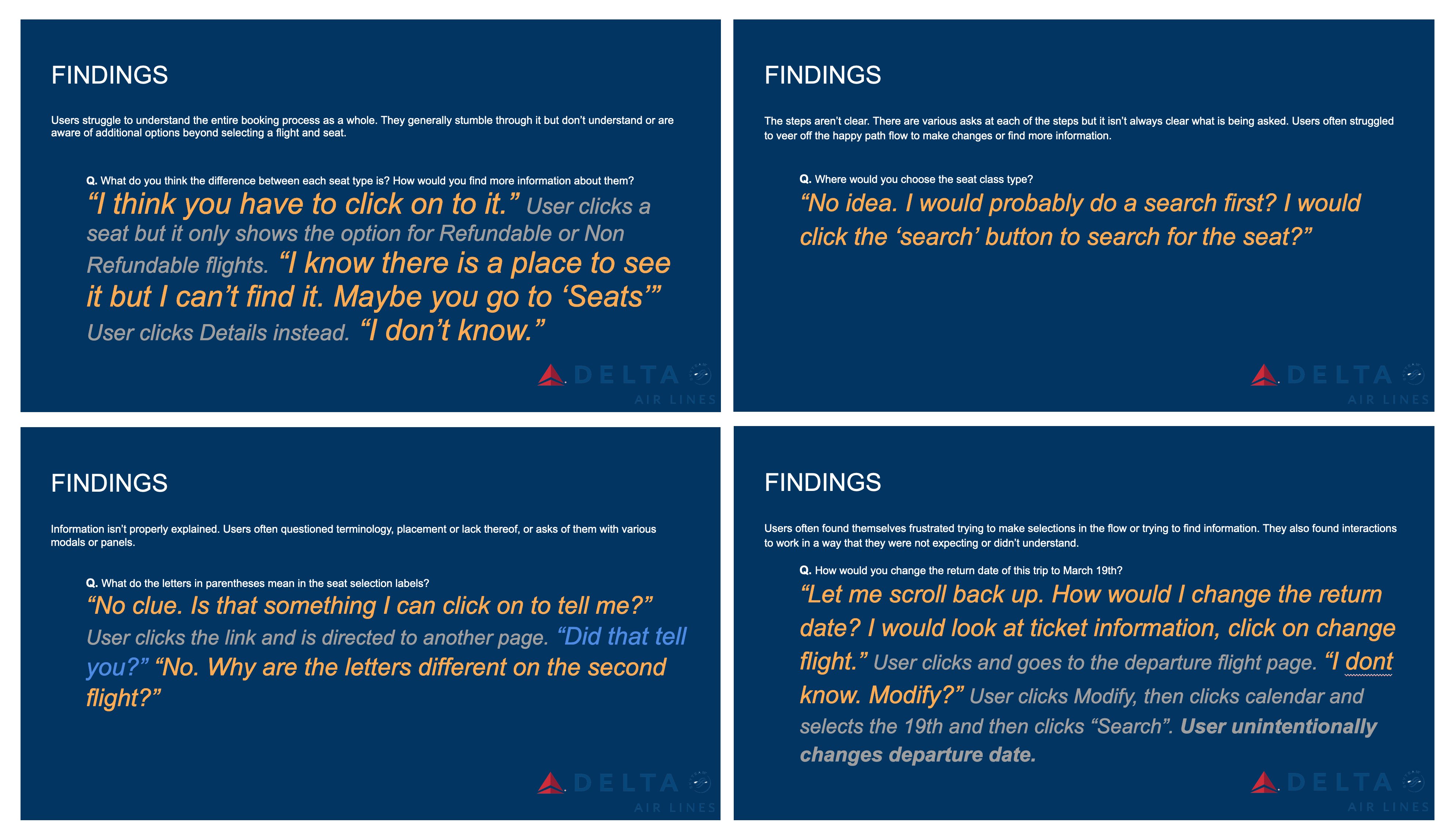
Problem Statement and Initial User Feedback.
User research was performed with two persona types, frequent travelers and occcasional travelers. Frequent travelers were used to the application and had little concerns however occasional travlers struggled significantly. In the research often times users were stuck and couldn't find answers or a way forward in the flow when prompted. Most were very frustrated during the research and said they would've probably given up by now or just guessed and hoped for the best. In addition to user research a competitive analysis of direct and indirect competitors was done to discover other ways users booking in other industries might be more successful. The results were mixed but found that airline competitors typically asked for more information including car rental, hotel and vacation stays which further confused users. Indirect competitors were much more efficient with less tasks and options for the user to choose from.
Elevating the Information
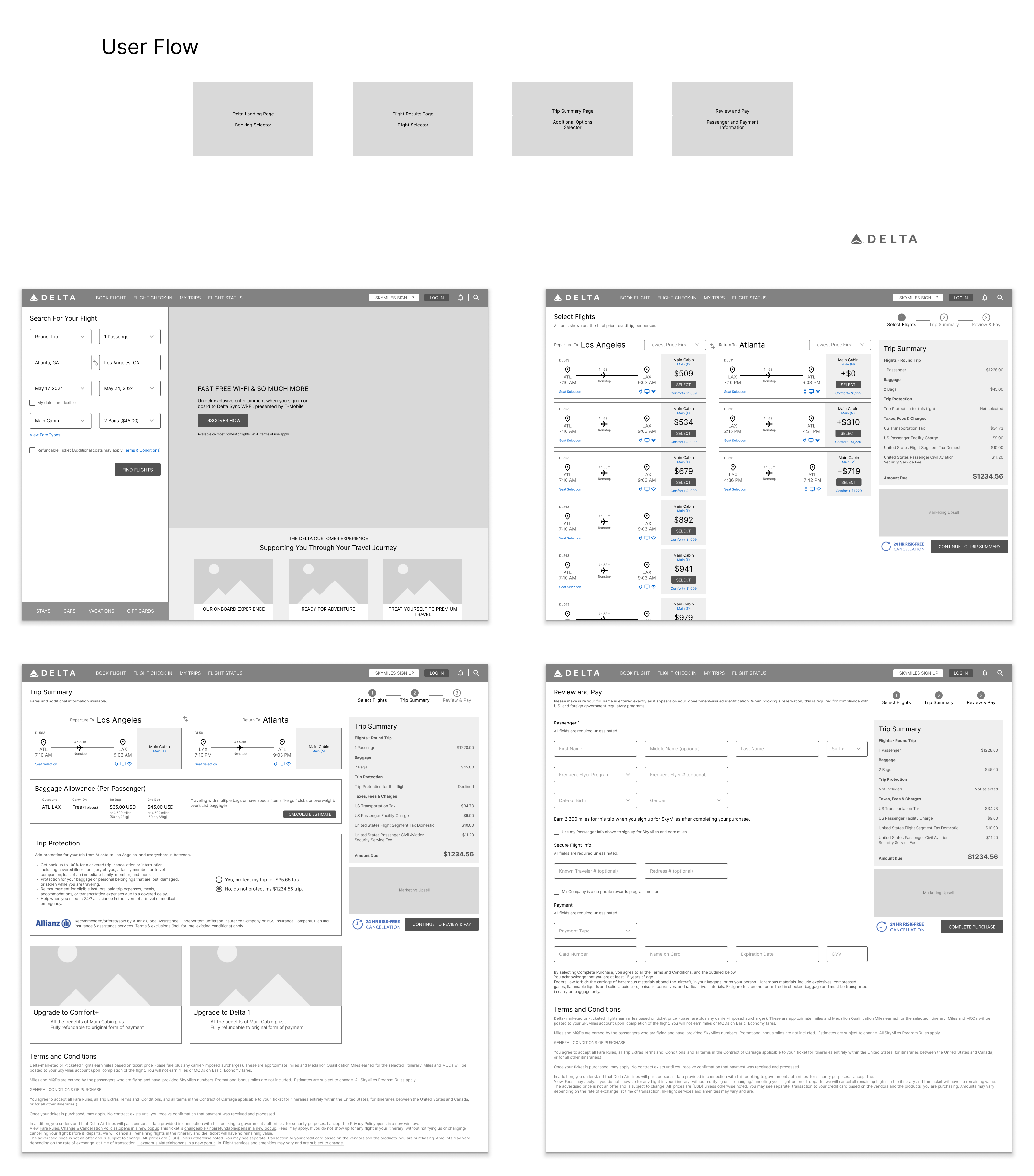
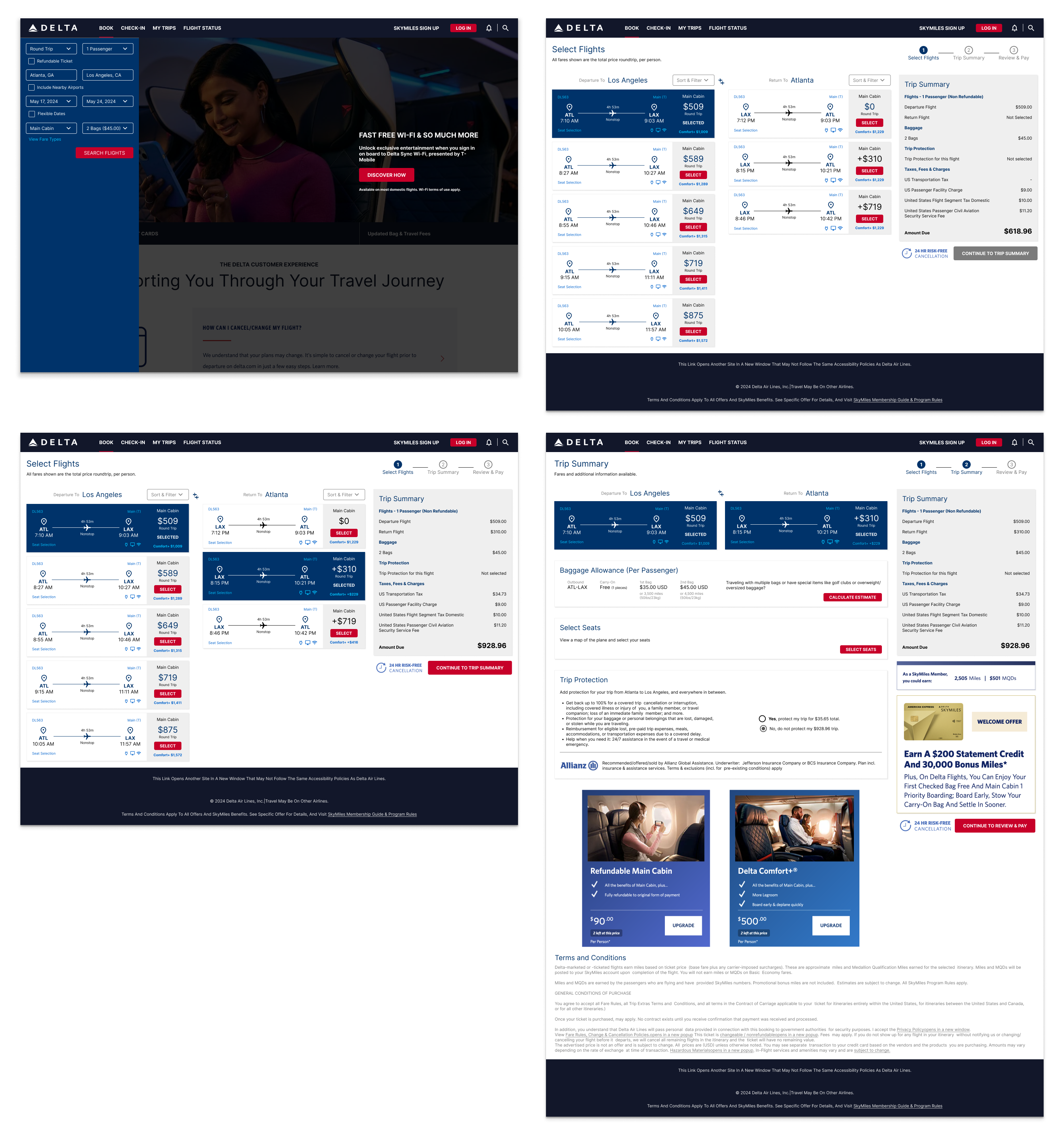
The goal of the initial wireframes were to elevate information that was hidden or hard to find. Some of the information was below the flow, behind collapsed sections or not in a step that was expected. There was also a major concern that the initial price of the flight would change based on the return flight but there was no indication this would happen when the user first selects their departure flight.
Initial Prototypes and User Research
During the first rounds of testing, we found that users wanted to see more information at once and not separated into different pages. The existing experience separated Departure and Return flight pages and check out pages. Users liked seeing both flights next to each other so that they could manage the price and see differences in real time side by side. Overall the flow length was cut by 50% by eliminated unnecessary information and combining related steps.
More Testing and Refinement
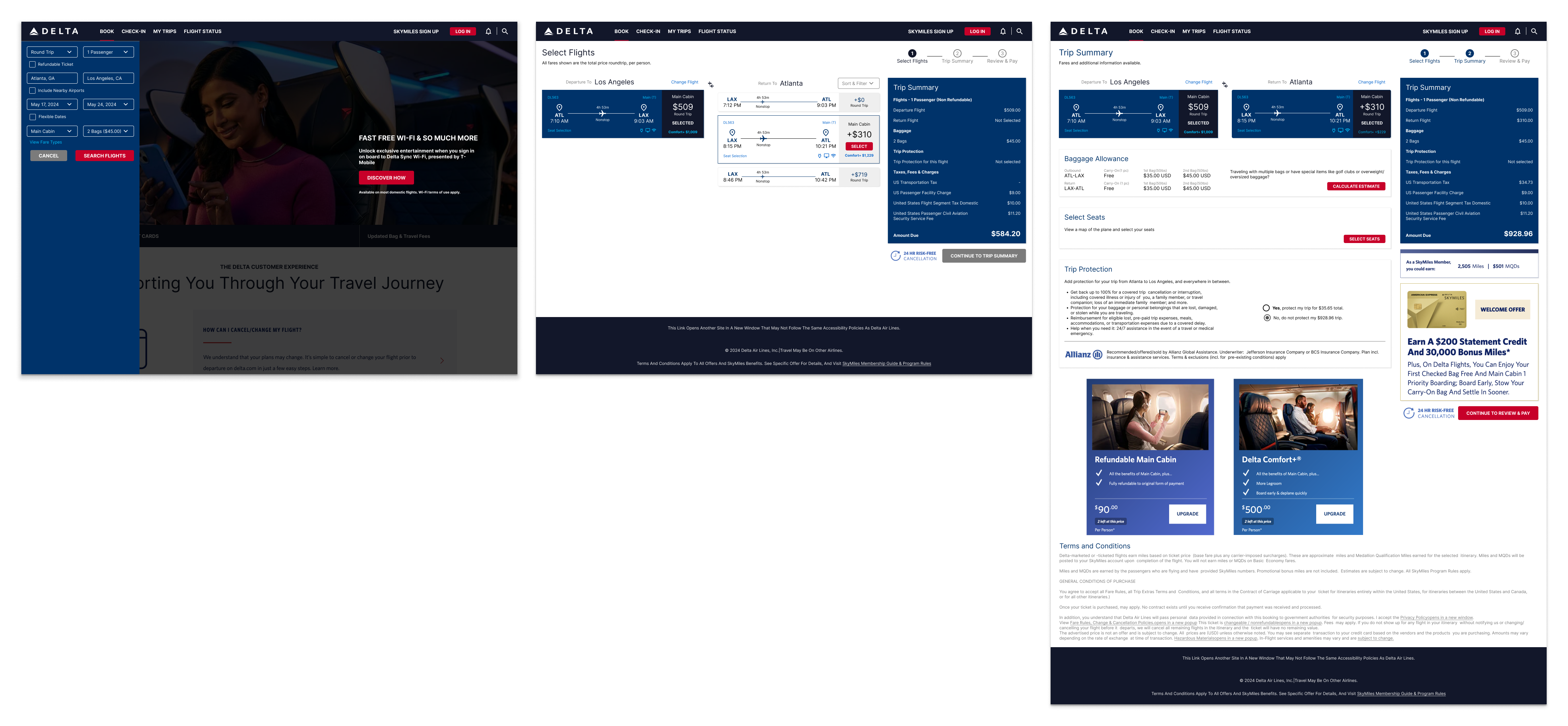
Further user testing created a more streamined process and refinement for each element on the page further elevated the most important information to the users. Those tested were very successful in booking and could explain, clearly, what they were asked for in each step. They were no longer surprised by fees or pricing and at the end of the flow were able to book their flight, choose their seat and cabin without doubt or questions.
