Ebay
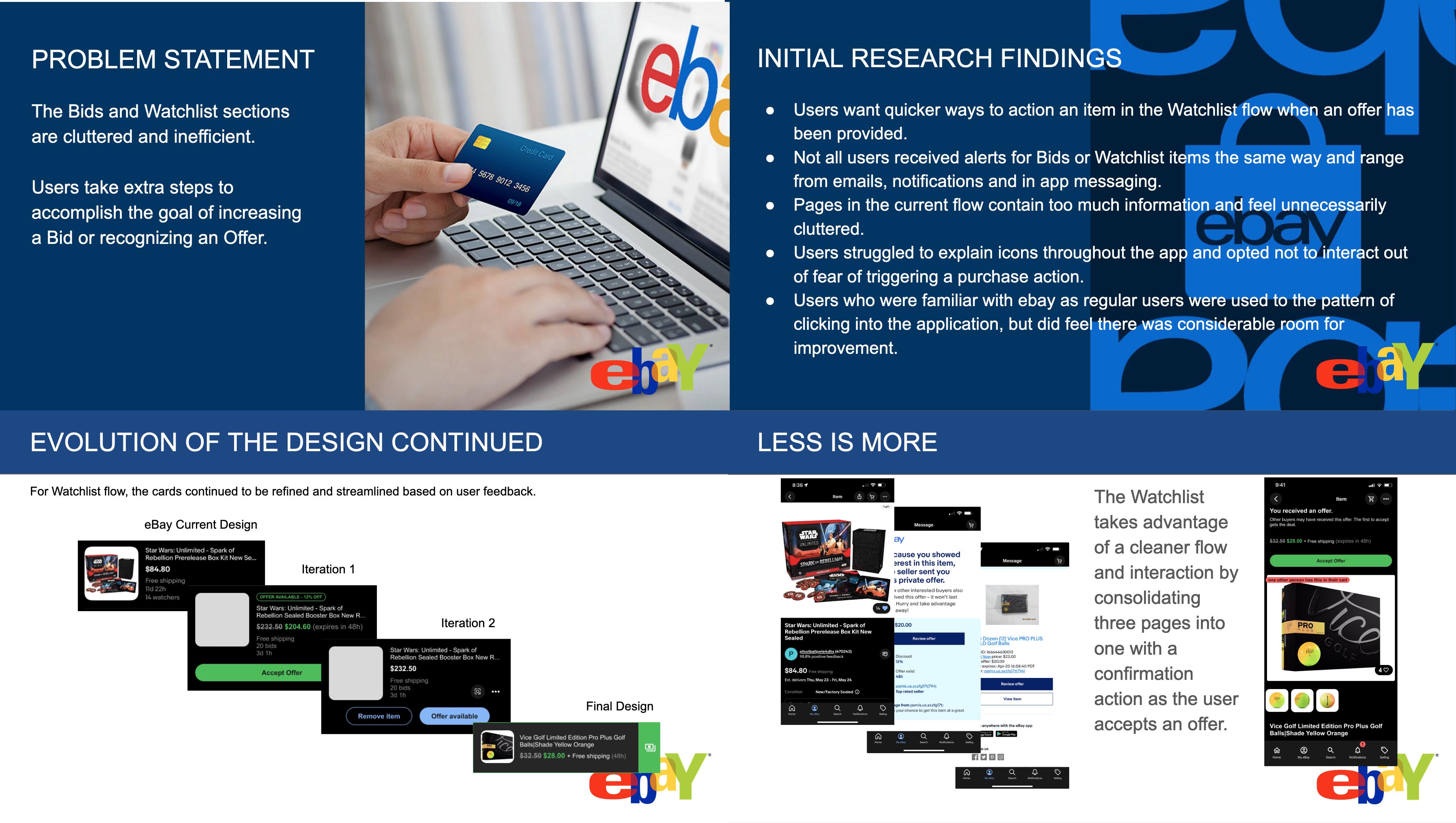
The Ebay Bid and Watchlist flows were in need of update and often users were confused by a cluttered interface, confusing flow or general lack of intuitive understanding while trying to view items they had bid on or were watching. The goal was to improve user interaction and allow users to access information quickly and deliver the information in a way that was intuitive, efficient and funneled the user to the exact location that provided to most up to date status of their items.

- User Experience Designer
- eCommerce, UX Design
- https://www.ebay.com/

Baseline Validation and User Research
The first step was to evaluate the existing flows and understand the friction within the current flows. User research was conducted using moderated interviews and having users, both exising and non-existing members, walk through the flows to accomplish specific tasks related to bids and watchlist items.


Incremental Design and Improvement
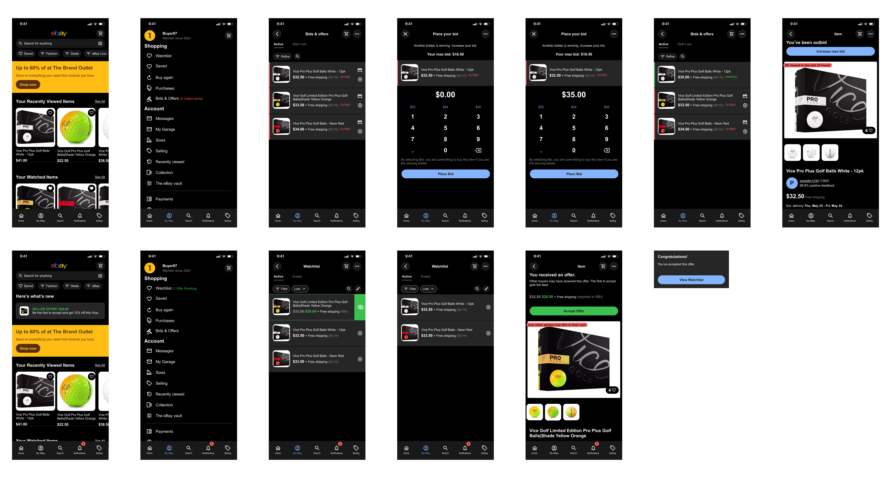
After initial research a more refined flow started to develop that combined many existing steps as well as elevated more important pieces of the flow to allow users to clearly understand where to go and what to do.

Final Design
Further iterations of design and testing were done to get to the final design. User interaction improved significantly and 95% of research participants were able to accomplish the task without issue while accomplishing their tasks.
