
Dodge
Dodge had asked for an entire site overhaul and rebranding. My task was to understand and design the new site starting with the information architecture and the page layouts. All of the pages on the site were redesigned and redeployed with the new look and feel with an updated and more engaging interaction.

- UX Lead
- Automotive, Agency, UX Design
- https://www.dodge.com/
Information Architecture
The key element to the site was the IA. The model information was designed to be at the forefront with the related pages secondary to allowing a user to shop and build their new Dodge model. A lot of consideration was spent on the navigation.
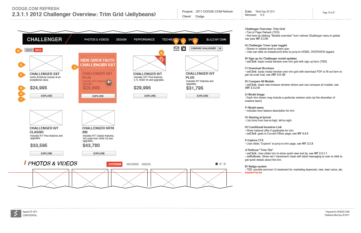
Model Pages
Users could reference model pages through the hero nav or through related overview pages. Each page allowed the user to drill further down through the experience and find more reference to the specifics of each model.

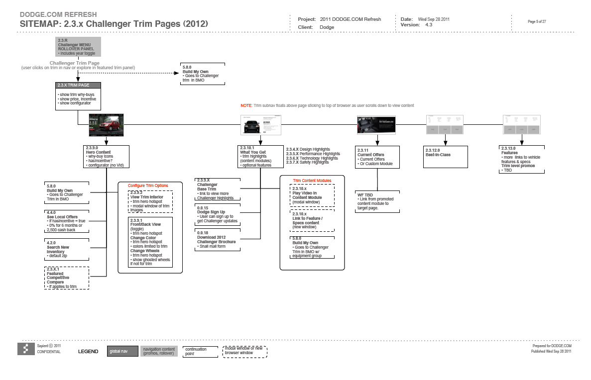
Trim Pages
As the user navigated down the model funnel, trim pages were leveraged as an important part of the flow to ensure if the user had gotten that far, they were served up the information specific to where they were in the journey. Not too much, but just enough to allow them to explore at that stage in their experience.
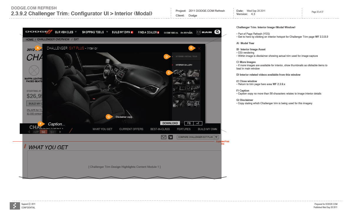
Interactive Pages
At various points throughout the site, interactive pages were used that allowed the user to click for more information. In some cases those clicks became more interactive and allowed a user to open and close panels, turn on/off lights and more.