Extended Stay America
For Extended stay I was asked to update the website as well as to create their first native mobile applications. Both of these experiences were designed together to ensure a common look and feel particularly with the reservations engine. The goal was that whether the user made a reservation online or on the app, if they referenced the app onsite, they would easily understand where to find the information they needed. In addition focus was put on travelers who might want to see, from the airport, where the closest Extended Stay America property is and have the ability to book en route.

- UX Lead
- Hotel, Mobile, Agency, UX Design
- https://www.extendedstayamerica.com/

Website Refresh
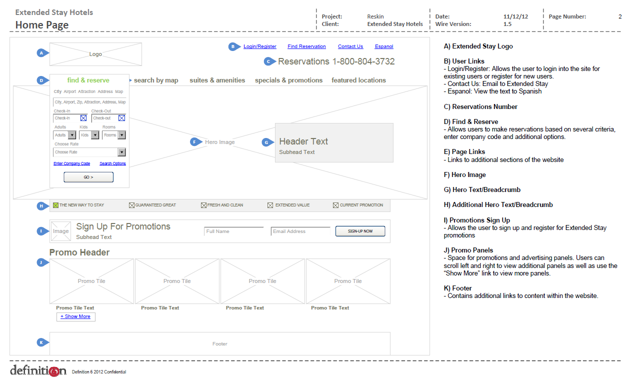
The refresh consisted not only of the visuals but the interaction starting from the main page and driving through to the checkout experience. The reservations panel was brought to the top level, promos and suggestions were added to the homepage to provide more options to the user.

Finding a Hotel
Research findings showed that users consistently wanted to see distance to location and price as the most important items when searching for a hotel. In these flows those items were given more prominensce and the reservations panel was built into the page so the user could more efficiently and quickly book the room of their choosing.

Reservation Checkout
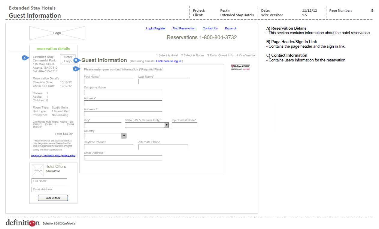
Again the reservations panel is prominent here providing an overview of the stay as well as all pricing and associated fees at the same time the user is being asked to provide payment information. Previously these were separate states which often left the user to have to search or not clearly understanding the billing aspect of their potential reservation.

Mobile App
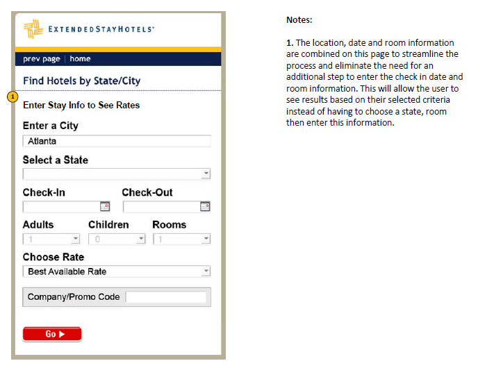
Carrying through with the updates and research done for the desktop version, the mobile apps also leveraged the same booking style and interaction. On mobile, these steps were more step by step and provided a primary focus for the user. In the initial step, the user is asked to provide location stay information before proceeding to a results page. Geofencing was also happening in the background during this step to provide a more efficient use of the app and more accurate location suggestions.

Search Results
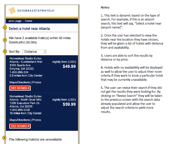
One of the goals of the app was quick response. With the persona of a traveler in mind, it was key that results be accurate based on location, and the response time was quick and clear. In this scenario the user is quickly given the closest options, availability and pricing as an immediate representation based on their search.
