FIAT USA
FIAT was still a new brand in the US when I started building an updated version of their website. Being part of the Dodge/Chrysler/FIAT family the ask was to have a similar look and feel across all product lines and leverage some similarities when possible to unify the brand experience. I was the lead on the project and designed the FIAT USA facelift, integration of the 500e and the launch of the Abarth lines.

- Lead Designer
- Automotive, Agency, UX Design
- https://www.fiatusa.com/

Information Architecture
The information architecture of the site was similar to its previous state allowing common experience that met user expectations when it came to car shopping with Vehicles being the primary destination followed closely by shopping tools and additional owner/enthusiast resources.

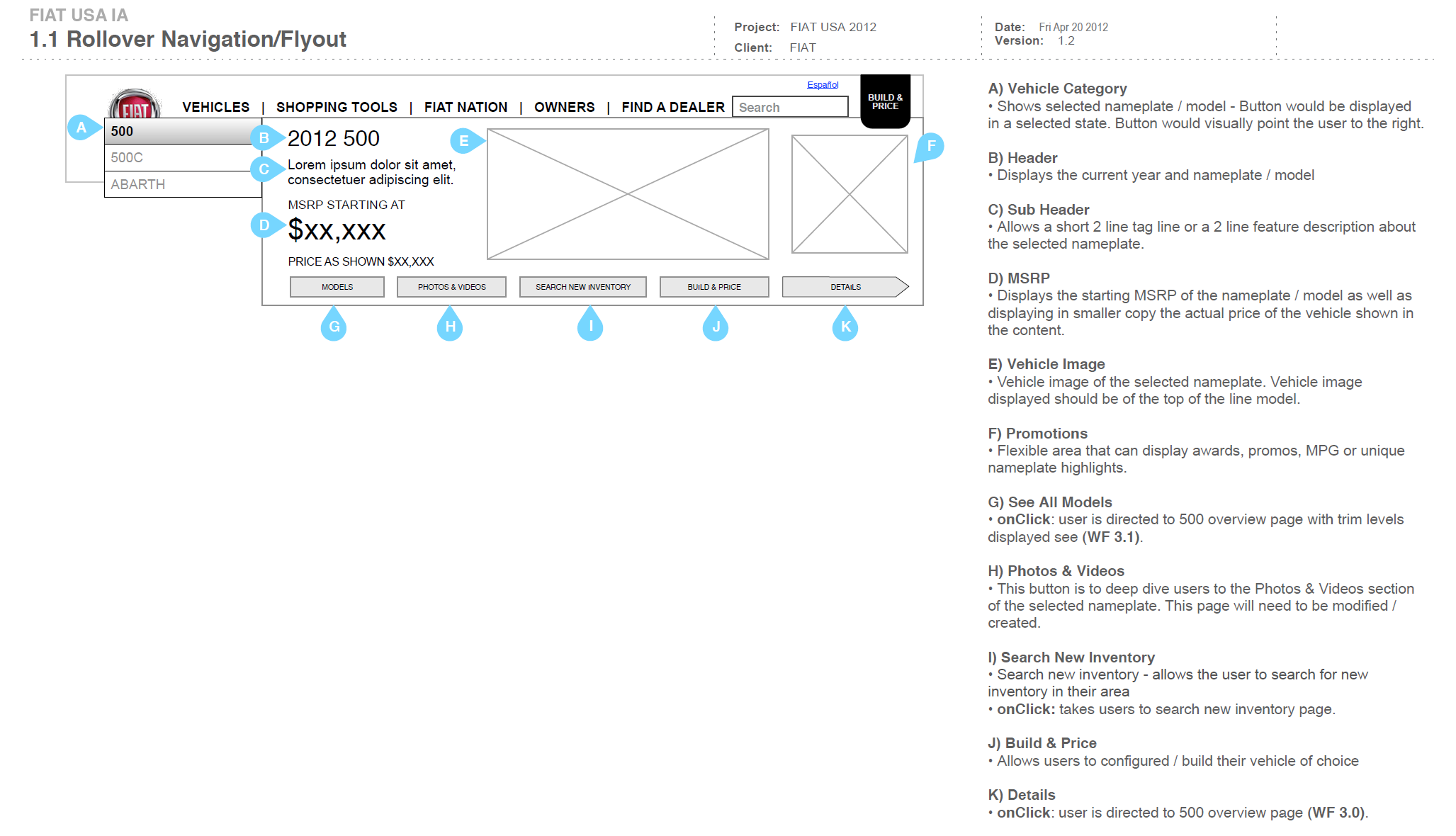
Hero Navigation
A robust Hero navigation was used to allow the user to get quick access to various parts of the site as well as the additional product lines with a visual advertisement like style leveraging heavy use of imagery and branding.

Model Pages
The Model pages were the key element to the website. Presented in a one page overview starting point, a user could quickly and easily view model trim, options, pricing and accessories with the scroll of their mouse.

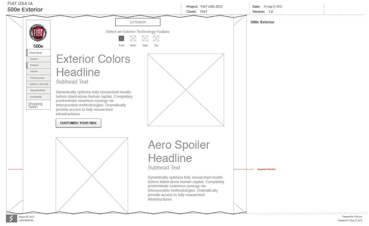
Integration of the new 500e
With the introduction of the 500e, FIATs first fully electric vehicle, it was important that the model have it's own presence on the website. Special care was given to the information architecture integration as well as the style of the page to keep it familiar but also highlight it's difference across the product line.

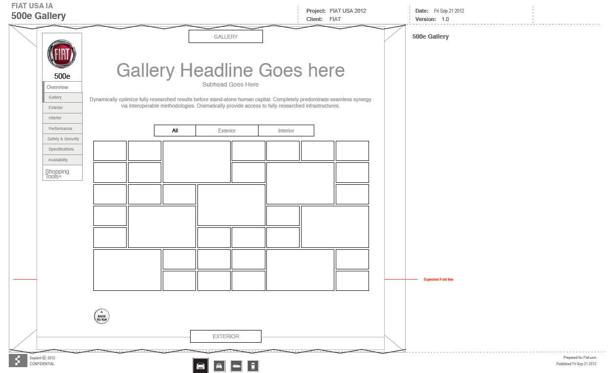
Lots of Imagery
It was very important that a curious user could spend much time viewing the 500e from any and all angles. A large gallery was added to the page.

Quick Builds
The page itself allowed the user to quickly customize a 500e inline without having to navigate to the Build page. This allowed the user to sample some of the options available to the car.
