Polaris
In 2014 Polaris was ready for an update to their website. They had seen my work with other large brands and asked me to redesign their site. It was important that the user could see all of their product offerings and each of the trims and options particularly as the rise of side by side vehicles was happening.
- UX Lead
- Retail, Off-Road, UX Design
- https://www.polaris.com/en-us/
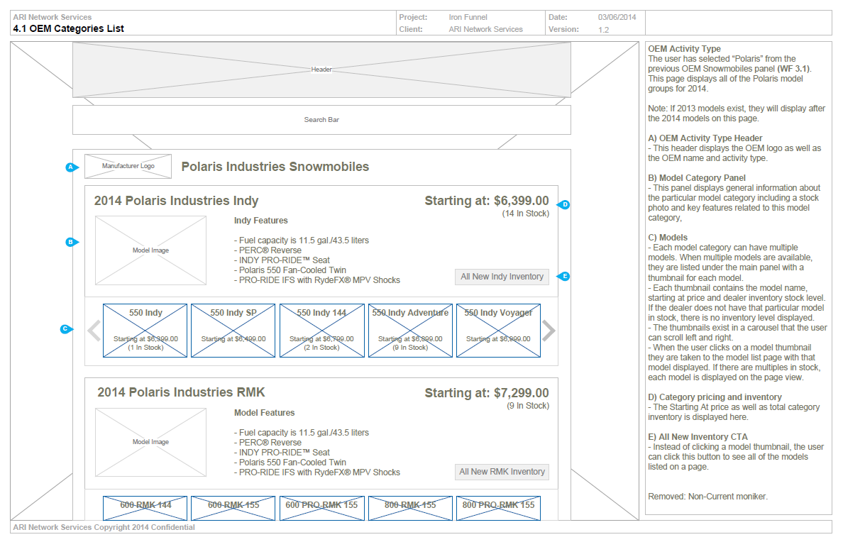
Product Categories
Polaris was unique in that it offers several product categories and within those, models and trims. The initial discussions were to have all of this information readily available to the user but in a clean and straight forward design that allowed the user to get the full depth of the offerings but not be overwhelmed or confused by its entirety.
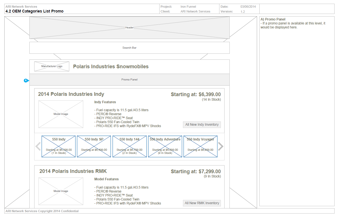
Upsell Promos
With any brand the desire to integrate promotions within the flow was important. With Polaris the use of hero banners within the top level category to immediately let the user know there were offerings within a specific model line was paramount. These banners generated significant traffic to the respective offer by an increase of 73%.
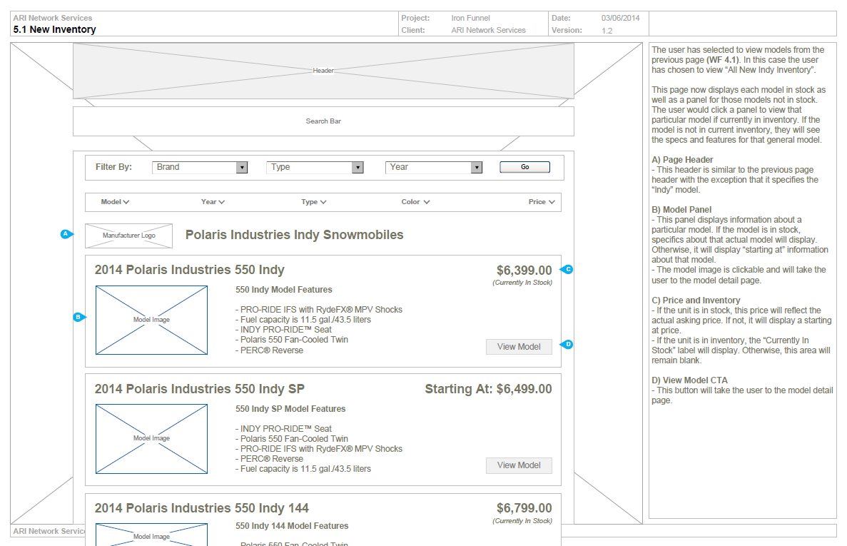
Inventory
Updated dealer inventory systems allowed integration into the website. Now users could shop for a specific model and find real inventory for purchase.
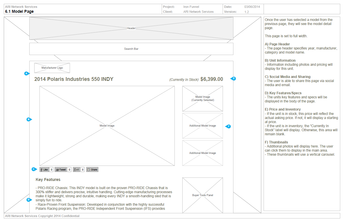
Model Page
The model pages were designed to highlight a model with key features, photos and model features as well as social media component for sharing.

Similar Models
Cross marketing using similar models was implemented based on real customer research data that would suggest other models that users also looked for during their shopping process related to their current selection.
