
-
FIAT Abarth
LA Auto Show Launch Site, FIAT Abarth USA Website
-
Ally Bank
SmartAuction

-
ARI Network Services, Inc.
PartSmart Parts Lookup Application

-
AT&T
Shopping Cart, Video Library

-
Briggs and Stratton
Parts Lookup Application

-
Chrysler
Chrysler USA Website

-
Coca Cola
Live Positively Website, Coke Donations Vending Machine Application

-
Cox Communications
Bandwidth Capacity, Interactive Bill, Performance Management, Voice Tools, WebMail

-
Dodge
Dodge USA Website
-
Extended Stay Hotels
Mobile Website

-
FIAT USA
FIAT USA Website, FIAT 500e Website

-
Fiserv
Innovation Designs, Wearables, Bill Pay applications, Mobile Bill Pay

-
Ford
Warranty Application

-
General Motors
OnStar Insurance Monitoring
-
Gunbroker.com
Auction Website

-
Harley Davidson Motorcycles
Parts Website, Website Design

-
IBM
Engage! Self Enablement Tool

-
LexVid
Online Certifications

-
Lotus Cars USA and Lotus Cars Ltd.
Lotus Cars USA Website, Car Configurator, Emissions Application

-
Meijer
Online Grocery Ordering

-
Mercedes Benz
AMG Website

-
MNTN
Connected TV

-
Polaris Off-Road Vehicles
Polaris Website
-
Porsche North America
Porsche Driving Website
-
SeaRay
Website Design, L Class Website Design, Mobile Web Design

-
Student Bridge
Student Tours

-
Thyssen Krupp
Dashboard Monitoring Application

-
University of Southern California
Time Tracking

-
Verizon Business
Global Sales Repository Design

-
VitaminWater
Jessie J Facebook Promotion

-
Yahoo!
Finance "Real Money"

GunBroker
I worked for GunBroker for several years and the goal was to emulate other auction sites that users were familiar with in an attempt to make the discoverability on the GB site more intuitive. We also improved upon the interaction of other auction sites when it came to the "My Gunbroker" section when it came to viewing and interacting with auction results, payments and all other user admin type flows.
- UX Lead
- 2002-2007
- Auction, UX Design
- https://www.gunbroker.com/

Updated Landing Page
The previous interation of this page was purely text driven with no real hierarchy of information. Users would often wander through the site or search in hopes to finding what they were looking for. With the new landing page, the page contents were sorted and filtered based on what users wanted as well as what the business wanted the users to see (i.e. Charity Auctions, Showcase Auctions, etc.).
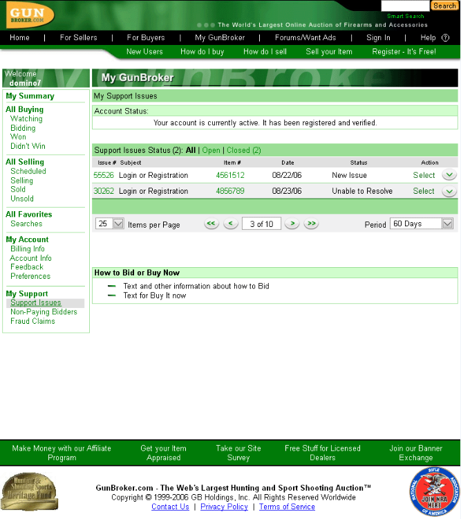
"My..." Pages
The backend pages where users tracked auction results, managed sold items, etc. was updated to improve upon the existing industry models of similar types. The goal was to limit the amount of pages and clicks and provide direct access to the areas of the where the users spent the most time. The data was also updated to display in a cleaner fashion and ridding additional clutter.
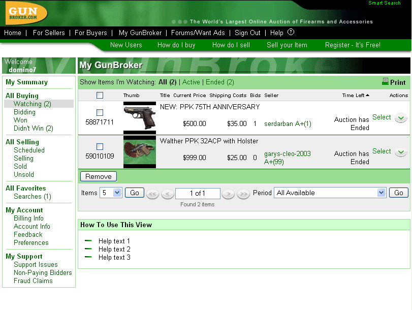
All Buying / All Selling
In the research findings, many users preferred to view the site from the All Buying/Selling pages which gave them instant feedback on auctions they were involved in. As a result, the design for these pages emulated a "filtered" view of the main site and showed only necessary elements used to interact with that item section.